

Pickr
A mobile app for a startup client to help groups of users select a restaurant
Summary
I was approached by a tech professional to create an app to help those in a large group select a restaurant at which to dine. My client envisioned this product to function much like a dating app: swiping left or right on desired restaurant options before coming across the best choice.
Pickr eliminates choice fatigue and makes the process of choosing a restaurant in a group simple and easy.
Problem
The problem that my client and I established was one rooted in indecision: groups of friends or acquaintances can’t decide which restaurant to dine at or cannot find one that accommodates dietary restrictions or budget.
Solution
Our solution to helping indecisive folks select a restaurant would be to build a native mobile app app that helps users decide which restaurant to go to in the style of Tinder, Bumble, etc. Users would swipe left to remove a restaurant from selection and swipe right for a more favorable choice, and the most selected restaurant would be decided based on the group’s swipes.
To initiate the process, we would need to create straightforward means of narrowing down the data pool by selecting wants (type of food) and needs (budget, neighborhood, dietary restrictions). We would also need to provide easy next steps after completing your choice, giving options to call the picked restaurant, finding directions there, among other tasks.
Tech
Figma
UsabilityHub
Google Slides
Roles
As the sole member of this design team, I was responsible for…
UX Research
Branding/Visual Design
UX Design
Deliverables
Competitive Analysis
User Surveys & Interviews
User Persona
User Flows and Maps
Sketches
Wireframes
Paper Prototype
High-Fidelity Prototype

Competitive Analysis
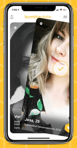
I began my competitive analysis with Tinder and Bumble, whose swiping function was the basis for the app’s functionality. Both of these apps had the same features: swipe left for no, swipe right for yes. For users who have downloaded a dating app before— especially the target demographic of millennials— this motion would be intuitive. I also noted the “super like” feature for Tinder. I thought of incorporating a similar function for restaurants, perhaps a “dislike” function to remove a restaurant the user didn’t especially love.


I also looked at some restaurant-related apps, be it web or mobile. One of my largest influences in my early designs was the web search feature for Yelp. These checkboxes of choices help to narrow down choices in the user’s search. I thought of how the pool of restaurants could be similarly refined in Pickr. Also, in terms of inviting a group to a restaurant selection, I looked to how to share a code. I found one I liked in a bill-splitting app called Tab, which allows users to send a code via iMessage, copy the code, or share it via an existing communication mobile app.
User Interviews
I conducted user interviews with five individuals who solidified the demographics solidified during this research phase:
44 year old male software engineering manager in New York
29 year old male project manager in Pittsburgh
30 year old female gallery associate in New York
29 year old female PhD candidate in Austin
31 year old female high school teacher in D.C. area
These are the same users with whom I completed the user test later on, and their earlier survey results helped deploy certain needs for my app.
In normal times, with whom do you go out to eat? Check all that apply.
There were some questions from my interviews that altered some focuses in my project. For example, this question, while simple, actually shifted my demographic slightly for my project. The answer, “dinner with friends,” won out with 100% of results, while “dinner with co-workers,” my initial vision for the app, truly lost out.
How do you select a place to eat/order from? Select all that apply.
Another question yielded similar realizations: “How do you select a place to dine at or order from?” All said word of mouth as most frequent use. This response made me realize that this app could not only be a tool for indecisive users but restaurants who want to publicize their business.
Perhaps the most crucial data point I gleaned from the user interviews: 80% users are indecisive when it comes to group choices. The only exception was the Gallery Associate from NYC, who was very much invested in spending time learning about dining trends in the city. This app would be especially helpful for these ambivalent folks, especially if they come together.
“One of my worst pet peeves is everyone sitting around debating a place to eat for 15-20 minutes. Let’s just pick a place!”
— Project Manager from Pittsburgh
While indecision reigns among a lot of users, it is rather annoying, especially for the Pittsburgh Project Manager. Pickr thus would relieve the stress of the overall decision process and resolve this user pain point.
“My partner keeps his nose to the ground to bars and restaurants and so do many of my friends. I let them pick over what I have to say.”
— PhD Candidate from Austin
Another result that helped change my overall perspective positively was the user story of the Austin PhD Candidate, as exemplified from this quote. The app would not just solve indecision: Pickr gives a voice to those who feel they don’t have one in these settings, perhaps if they believe they’re unqualified in giving opinions about restaurants.
Audience
Our target audience for Pickr would be millennial working professionals, ages 25-45, who live in metropolitan areas or tech centers, like Seattle, San Francisco, New York, or Austin.
User Persona

Based on insights gained from my research, the user persona I created was Kerry Louis, a 32 year old Project Manager in the Austin area. Her goal was to find a restaurant to accommodate the needs of colleagues she didn’t know well.
A Chicago native, Kerry moved to the Austin area after completing her graphic design degree at University of Illinois. She has since spent the last few years working her way up in her company to Project Manager and is proud of the work she has accomplished thus far. Austin has been a welcome change weather wise from Chicago and Urbana-Champaign— she loves spending time outdoors, whether it is running along Lady Bird Lake or having outdoor drinks with her friends in East Austin.
Motivations:
• Finding a restaurant that meets client needs as well as her own
• Getting to know her new clients better through the restaurant choice
• Discovering a new place to take colleagues after work
Goals and Needs:
• Select a restaurant that meets both hers and her clients’ needs
• Find an easy way to contact restaurant for a large group reservation
• Get directions easily, especially for these out-of-town clients
Hesitations & Pain Points:
• Making new clients use an app they may not have
• Some folks from out-of-town, what if they don’t like the selection?
• Not wanting to dine at a restaurant that’s too obscure


Maps
I then applied this persona of Kerry Louis through two different maps: a journey map and an empathy map. I wanted to connect more with how a user like Kerry would think and feel upon downloading and using the app. Especially with the journey map, I realized the relief Pickr could provide in a group situation-- the app helps to make stressful selection fun and allows the user to find joy in finding a restaurant to eat at.

User Flow
After closely gauging how a user like Kerry would approach Pickr from all angles, I simply broke the user flow down to a flowchart, analyzing how both a user making a Pickr and also joining one would on-board and use the app.


Sketches
My first sketches solidified many of the ideas I explored through wireframes. In the first image, my sketch shows how much the Yelp competitive analysis influenced my initial ideas of narrowing down the restaurant groups. The center image sketches out the swiping feature of the app and how these restaurants will be presented to the user. The last sketch displays this final screen once the group decision is made with actions for further planning, such as directions to the restaurant or making a reservation.


Paper Prototype
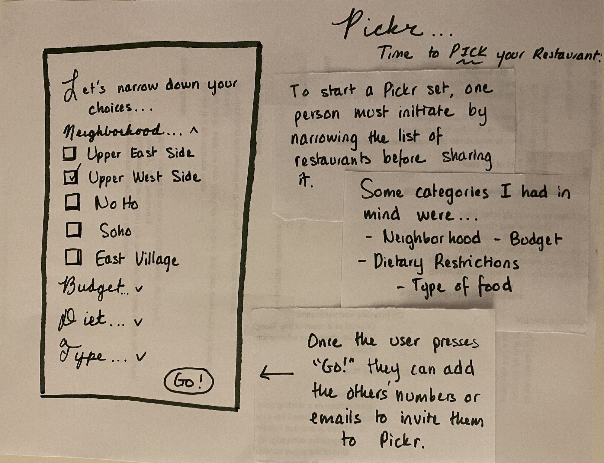
I then applied my research through these maps into a paper prototype, thinking of how the user would interact with this flow on a mobile device (in this case, an iPhone 11 or 12). This paper prototype contains an earlier iteration of drop-down menus on the selection screen, which I will elaborate on later.


Wireframes
In the first iterations of the Pickr wireframes, I show the first steps of using Pickr before the swipe left and right function. The first home screen will primarily welcome the user. To access the second screen, the user would select “Make a Pickr,” the name of the app but also the group function to make the restaurant selection. The user would then specify what they wanted by clicking the light font to fill in the sentence.The last screen allows the initial user to share the Pickr group with their friends, be it by text (iMessage, Whatsapp, etc.) or by copying the code and pasting it into their desired mode of communication.


These three wireframes show an iterative process in my design. Before, I had the user fill out a series of checklists, kind of like the Yelp web search I showed earlier. I wanted Pickr to be a welcoming and fun experience for the user, taking the stress out of the guesswork of picking a restaurant. I then changed these queries to a fill-in-the-blank sentence. I initially had drop down menus to select content, but again, it reminded me— and users in tests later— of a web app rather than a mobile app. My final choice was to use pickers and sliders for the user.


For the wireframes of the selection process, I gleaned a lot from my competitive analysis through Tinder and Bumble, emphasizing swiping left as no or thumbs down and swiping right as yes or thumbs up. The final page, announcing the group’s selection, allows users to call restaurants to make reservations or get directions— I wanted to include these calls to action to make the restaurant selection process all the more integrated in the app, even after making the desired choice.
Summary of User Testing
During the user test— which I completed with the same five individuals I did for the user interviews— I asked users to complete three simple tests: point out how to make a Pickr group, create a data set for a low-budget restaurant, and complete the left-right process. I also completed A/B testing with the data selection screen in wireframes using UsabilityHub. The idea of selecting data parameters through a sentence rather than checking boxes was more welcoming and fun to users, “almost like a game” in the words of the NYC Gallery Associate.
Summary of Findings & Future Plans
What I discovered through user testing was an overall positive sentiment among users about Pickr. 100% found the application useful, and they wouldn’t mind downloading another mobile app because it’s helpful in social lives. 80% would likely use it again soon.
100% of users also loved the retro-inspired visual design. This was the first comment made across all user tests when asked what their first impressions were of the app. After completing the tasks, they mentioned that the streamlined, monochromatic visuals put them at ease and made the process of selection all the more seamless.
For future development, the client and I intend to cross promote with restaurants through sponsorships or collaborations with apps, perhaps a reservation app like Resy or Open Table. Having sponsored restaurants or deals would allow for revenue for the stakeholder, creating a financially viable future for Pickr. A collaboration with restaurants would also allow for publicity beyond word of mouth. I also plan to expand the final page to include an option to view the data of the entire pool of choices: what was the second most popular choice? Were any restaurants outrightly rejected?
Even beyond restaurants, the client and I realized that Pickr could act as a great framework for other difficult decision-making processes. While the initial phase of this app may focus on restaurants, why not apply the same framework for other choices between friends (such as picking a movie in theaters)?

Clickable Low-Fidelity
Prototype


For my low-fidelity prototype, I created a retro visual design inspired by diner menus. This aesthetic influenced the typography (Palm Canyon Drive and Futura), the asymmetrical logo, and the star motifs found throughout the app. My color palette— a monochromatic combination of red and cream— was created with accessibility in mind, passing on WebAIM with a 4.53:1 ratio.
From the home screen, the user can make a pickr by clicking make a pickr. That button will take them to this data selection screen. The CTAs are noted by red boxes around each parameter, and the blank fields will be filled in once the user makes their selections. In this example, the user can select a budget ranging from inexpensive ($) to expensive ($$$) using a pop-up modal.

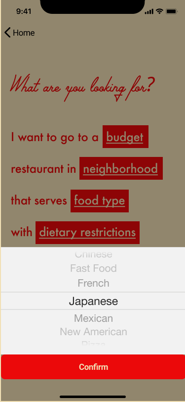

For the other parameters beyond the budget, I ended up using a picker (ha!) to diversify the selection process. I wanted to experiment with the consistencies of this decision, and I didn’t want users to mindlessly select a parameter because all the processes were the same. This idea provided the opportunity to change things up and catch the user’s attention.


After selecting “next,” the user would have the opportunity to share their code with their group, be it by clicking on “share code” or by copying the link and pasting it into their desired mode of communication.


On the selection pages, I used a photograph from each restaurant in black and white, a clean yet informative image against visual design. I added a “learn more” text link on these pages, which captured the attention of 4 out of the 5 users interviewed. I want to especially focus on this feature in future iterations of the app, as the information listed would help users decide whether to swipe left or right. I also made a lot of the features consistent on the final screen, with the same image and information included as found in the selection pages.
Final Thoughts
Overall, I am rather pleased with my results, especially with the positive feedback I received in my user tests. I learned a lot through the process:
Sometimes, a target demographic can shift based on user research.
While I thought that maybe Pickr could be used primarily in work environments, the user interview results showed that the app would work well among friends and family.
Each iteration of the design process can provide new refinement of insights.
I learned this in multiple ways, from the redesign of the data selection screen to helping understand further implementations of the app. For example, not only will our app help people select a restaurant to dine at, it could also be a good marketing tool for many restaurants in the area.
The framework of an app can be used for other purposes in the future.
As I addressed in my plans for development, my client and I realized that Pickr could be used to make a variety of choices, such as selecting a movie. I learned then that when creating an app, the design may not be limited to its initial purpose— why not see what the future holds for your design?