
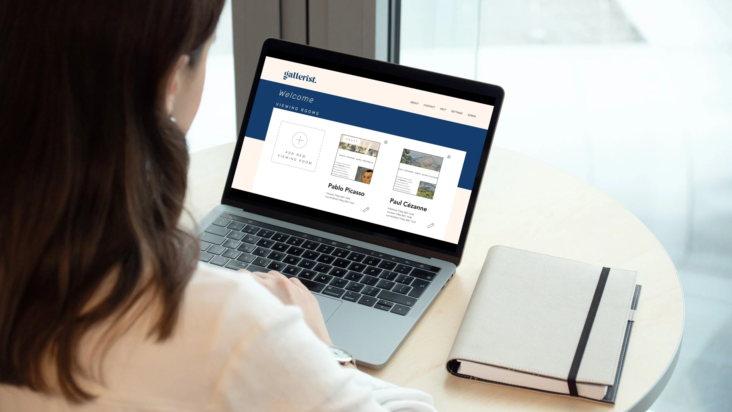
Gallerist
A desktop web app for administrative users to build online art viewing rooms
Summary
Online viewing rooms are an up-and-coming tool within the art world that cropped up at the start of the COVID-19 pandemic. With a sudden need for galleries and art institutions to display art online, existing companies adjacent to the art world– databases, CRMs (Customer Relationship Management systems), and art e-commerce sites– began to quickly deploy online viewing room platforms to meet rising demand. As the individual recently tasked with building a gallery’s viewing rooms, I developed Gallerist to address a void in the market today: a clean, easy-to-use platform for administrative users.
Gallerist is an art viewing room platform that focuses on ease and simplicity for the administrative user.
Problem
Existing viewing room platforms place more value on cutting edge front-end features, such as VR gallery spaces. However, by focusing exclusively on what the client of the gallery is viewing, the administrative user building the viewing room gets lost in the mix. Since their user flow is unacknowledged, the process of building a viewing room is difficult as a result.
Solution
Based on interviews with administrative users and personal product knowledge, my solution is to build a desktop web app that allows users to build viewing rooms in real time with drag-and-drop features. Through competitive analysis, I learned that most viewing rooms are not stand-alone services, and the administrative end often is adopted from other services the company offers. Gallerist allows not just a great platform to view art but is custom made for the needs of the user building a viewing room.
Tech
Figma
Invision
Maze
Google Slides
Role
As the sole member of this design team, I was responsible for…
UX Research
Branding/Visual Design
UX Design
Deliverables
Competitive Analysis
User Surveys & Interviews
User Persona
User Stories, Flows, and Maps
High-Fidelity Prototype
Sketches
Wireframes
Branding
Mockups
Competitive Analysis
What I learned in my competitive analysis was that most offerings do not provide a view into the administrative end of their product unless you are a paying customer. Most insights that I got into these portals came from user surveys or personal product knowledge.

Courtesy of Artlogic
The main competitor to Gallerist I found through my research was Artlogic, which is a database and CRM that offers stand-alone services for viewing rooms as well as websites. Their viewing room offering currently dominates the marketplace. Their marketing focuses on online viewing rooms as another means of generating sales for galleries. For example, their data capture tool allows galleries to grow their client base through online leads. On the front-end, viewing rooms can be created with existing themes, and other features, such as “View on Wall,” allows buyers to see the artworks on a wall space.
Another competitor to Gallerist, albeit indirectly, is Artland, VR/3D technology for viewing rooms connected to market platform. Their viewing room galleries are advertised as “Beautifully Simple Online-Only Exhibitions,” not necessarily as sales tools. Moreover, they emphasize the ease of their program: “Use only JPGs, and little of your time.” Overall, Artland is an extension of a gallery’s programming, not necessarily gallery sales.

Courtesy of Artland

Courtesy of Exhibit-E (L) and Arternal (R)
Meanwhile, most other competitors only offer viewing rooms as an extension to other existing services and products. Exhibit-E, a website design firm specializing in creating websites for arts organizations, allows for viewing room pages to be added to their websites, and Arternal, an art CRM, also promotes a viewing room component. Artsy, a leading digital sales platform for fine art, has viewing rooms too, but they’re only accessible with a membership to their site.
User Surveys and Interviews
My user research consisted of user surveys and interviews with administrative users of online viewing room platforms. Because of the niche market, I specifically focused on those who work in the art world. 100% of respondents work in NYC galleries, be it as directors or other workers, such as registrars or gallery assistants. Through competitive analysis, I learned that galleries and art fairs are targets for viewing rooms. The respondents of my survey thus reflected the target demographic of existing products.
100%
of survey respondents have looked at viewing rooms and have built platforms themselves for gallery artists.
In response to the survey question, “What is the purpose of an online viewing room?” answers were varied.
“Find/provide engaging information about artists and their works”
- Gallery Director
“To communicate important information that a person might not get from a gallery visit or press release.”
- Gallery Registrar
I followed up with two respondents for user interviews, both of whom used Artlogic, and asked what their pain points were in their viewing room experience. I illustrate the roadblocks they describe using screenshots from the Artlogic platform I use.
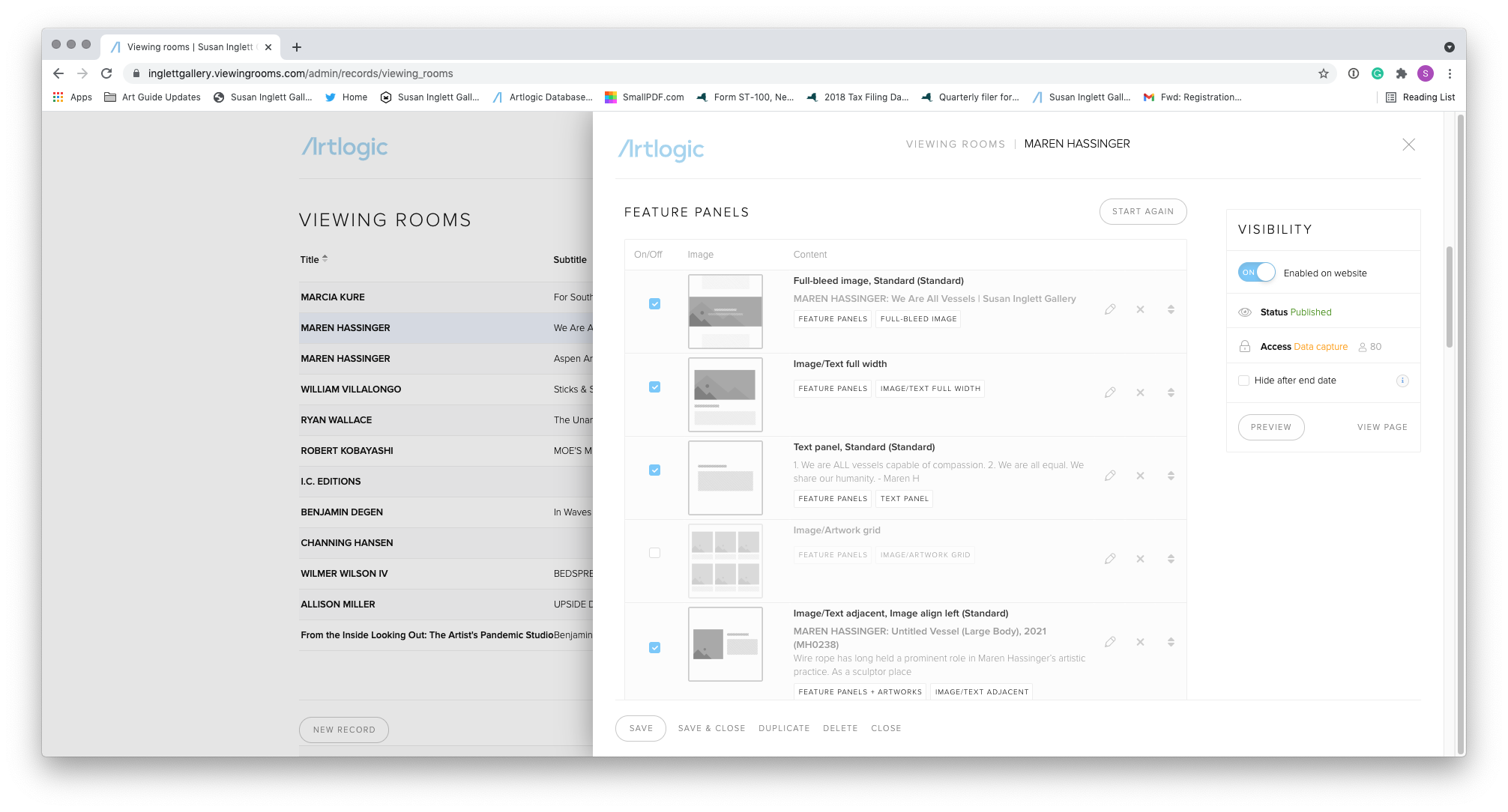
Editing Portal of Artlogic
Preview Editing Portal of Artlogic
“There are two different portals for editing a viewing room. It’s so confusing!”
— Gallery Associate
There are two different platforms for editing a viewing room on Artlogic: the editing portal from the viewing rooms list (at left) and on the live preview page (at right). To see changes in the viewing room, an Artlogic user must select a “preview” button, which opens a new tab. The Gallery Associate addressed how it’s confusing to have so many previews tabs open at once and how sometimes, changes made on the preview panel can overwrite the main panel.
My solution to this pain point was to create a platform on Gallerist that allows the user to view their changes in real time, not through multiple preview tabs.
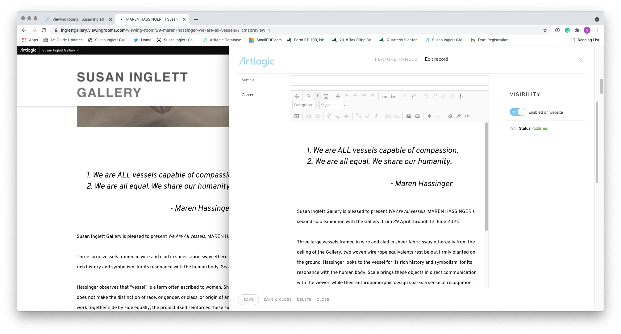
Font Editor 1: Paragraph
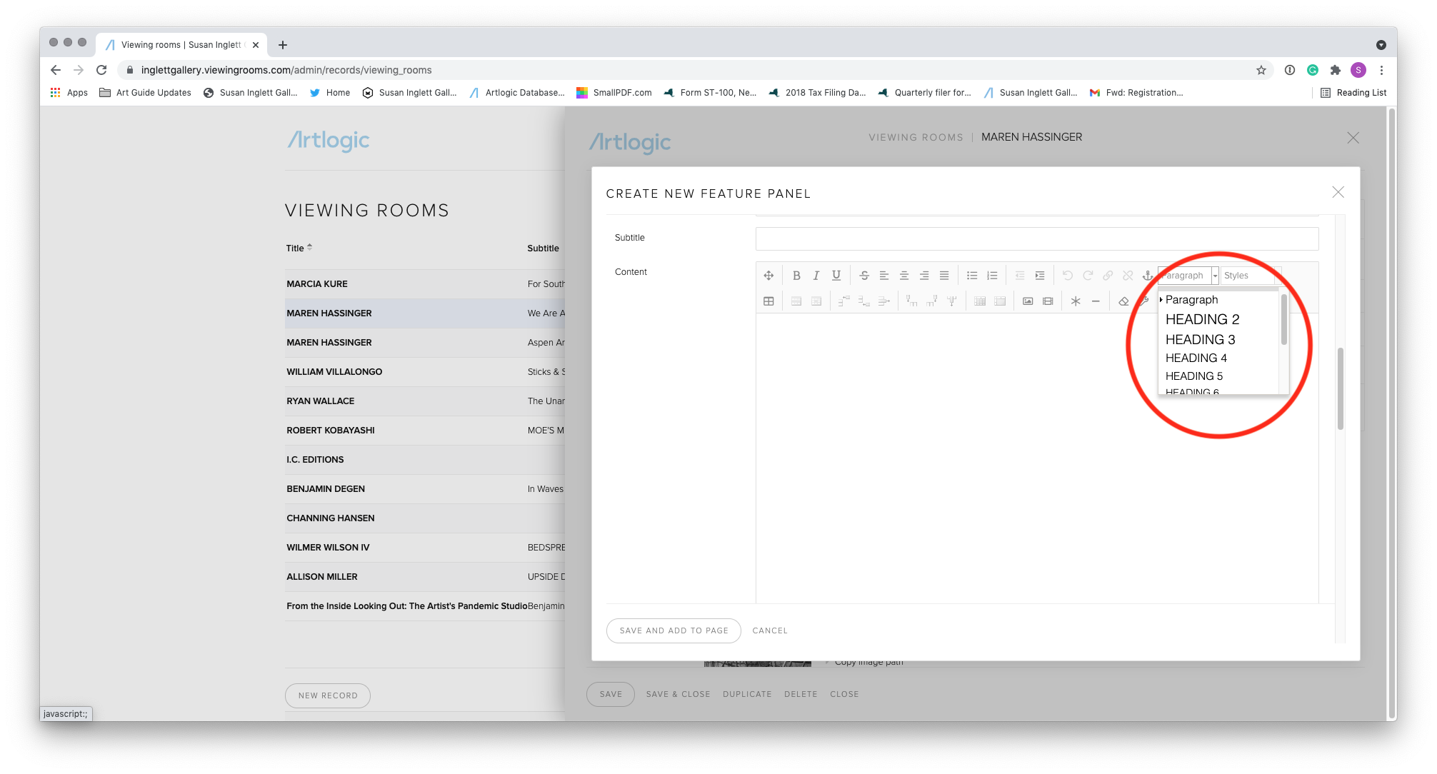
Font Editor 2: Style
“As a designer, more customizable text options. VRs prioritize accommodation across screen sizes over style. It’s novice-proof, but there’s a happy medium.”
— Gallery Registrar
While the Gallery Registrar asks for more text options, Artlogic’s text editing panel is also unclear in its options. There are two categories: Paragraph and Style. To compound the confusion, the dropdown menu does not realistically show how the text will show up in the viewing room, and there isn’t a clear difference in the formatting choices between these two categories. Although the selection is limited in terms of font, there is decision fatigue too in terms of the selection in the dropdown menu.
Based on this response, I thought of several features that would make the viewing room experience customizable, from fonts to formatting of content overall. With text specifically, I created a menu that allows the user to select a range of fonts with a selection of sizes within each text category.
User Persona

The user persona I created as a result of my research is Melanie Roberts, a 29 year old gallery assistant here in NYC. Melanie grew up wanting to make art and excelled in her art classes and discovered a love of art history in college, becoming a studio and art history double major. After she finished her undergraduate degree, she enrolled in Sotheby’s contemporary art MA program in New York and subsequently became a gallery assistant in a Chelsea gallery.
Motivations:
Tasked with replicating a real-world gallery experience online
Make the artwork as salable as it is in person for clients
Create a narrative with an artist’s body of work
Goals and Needs:
Building a curatorial narrative in the viewing room
Add and integrate new features easily without user error
Build this viewing room fast and efficiently
Hesitations and Pain Points:
Two different points for editing a viewing room → why does one overwrite the other?
Limited means of editing → will that make for a nice looking viewing room?
Lack of customization → will my viewing room look like everyone else’s?
User Stories
Initially, I created user stories for the wide array of users for an online viewing room platform: the administrative user building the viewing room, a gallery’s client looking at the viewing room, and the dealer themselves generating a sale through a viewing room. I ultimately prioritized a user story of the administrative user like Melanie, and I narrowed the scope of the initial iteration down to three stories:
As a gallery worker building a viewing room, I want to…
…see the elements I am adding to the viewing room in real time so that I can efficiently see how my viewing room is constructed.
…upload hi-res images easily so that I can show users available works.
…edit the layout of my viewing room so that I can cater it to the work at hand.

Storyboard
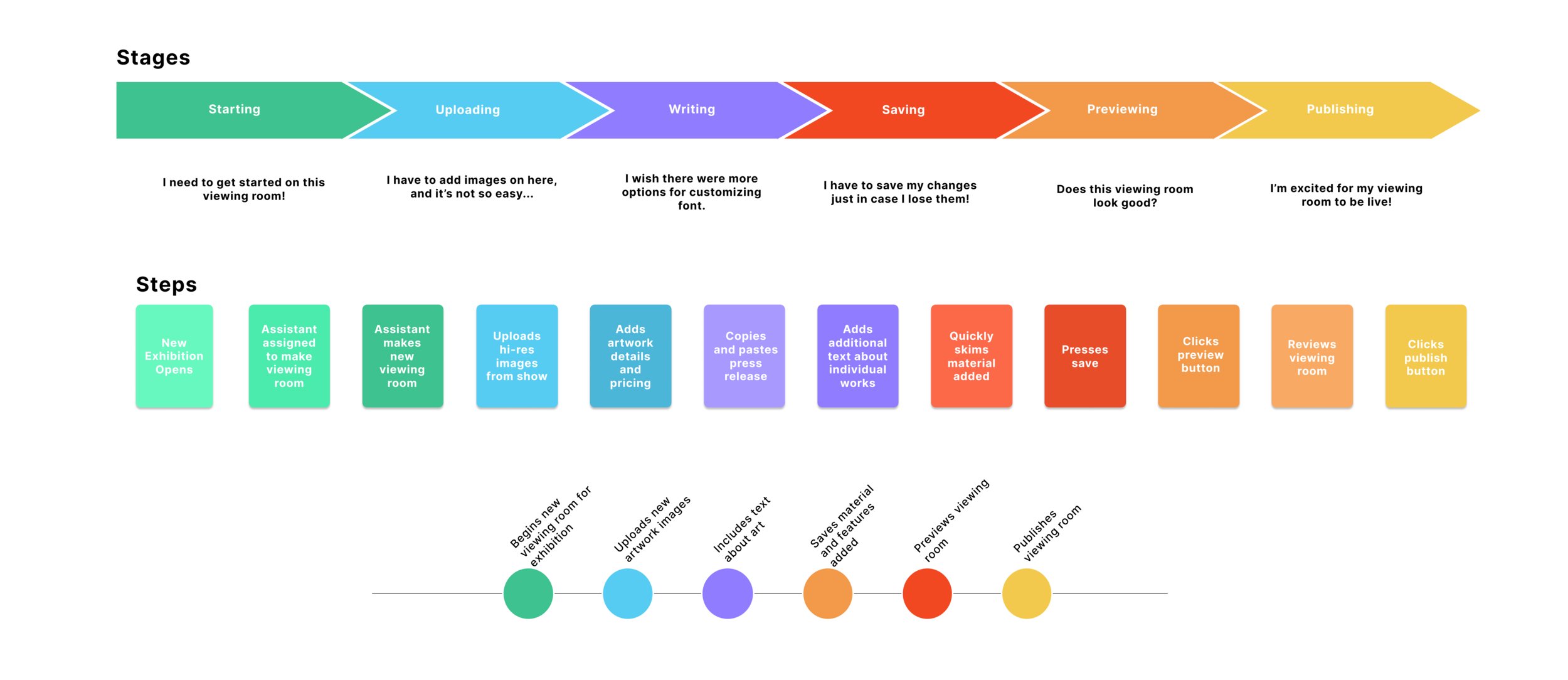
Journey Map
Map and Story Board
In order to better empathize with Melanie— although I have been in her shoes many times before!— I utilized a storyboard and a journey map to connect with her feelings in the process of creating a viewing room. What I gleaned from this process was the feeling of satisfaction in finishing the viewing room and how a seamless process throughout contributed to that sentiment.

User Flow: On-Boarding

User Flow: Editing a Viewing Room
User Flow
The user flow thus followed the administrative user of Gallerist in building the viewing room. Because there are multiple decision points in a highly interactive platform, I focused specifically on two flows: making the viewing room and editing the viewing room.

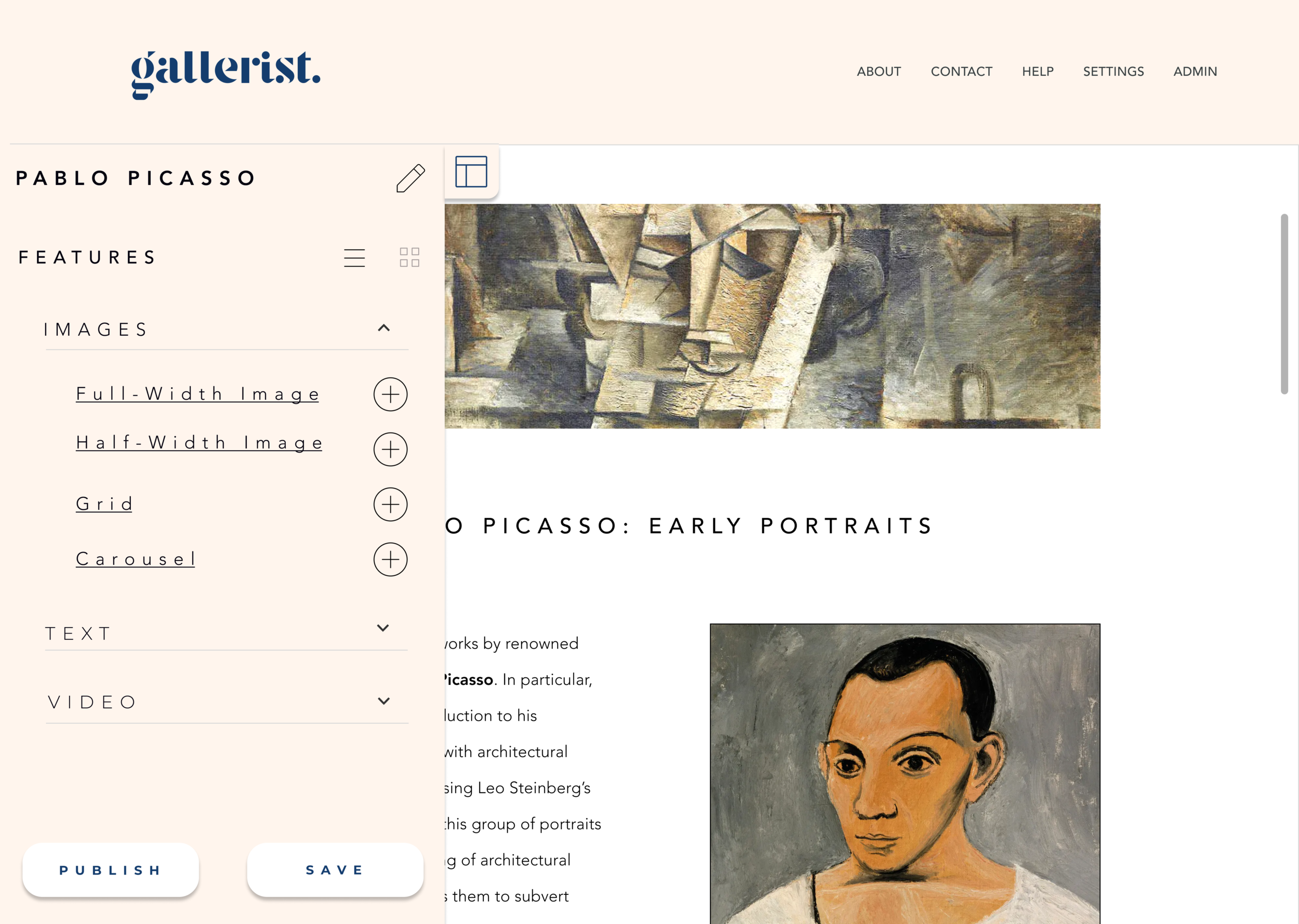
Initial Sketch
Shown above is a simple sketch I made when thinking about the editing page of Gallerist, and I kept the design pretty consistent since this point. On the left third are dropdown panels of features that a user can drag-and-drop into the right preview, taking up two-thirds of the screen. There are respective Save and Publish buttons at the bottom of this features column, and an eyeball at the top right can take the user to a live preview. The grey box sketched in the foreground represents the modals that would pop up when a user would add features to their viewing room. It’s through these modals that they could upload image files, input artwork information, and more.

Main Screens

Adding a New Viewing Room

Modal Feature
Live Preview
Wireframes
The wireframes I created laid out this administrative user flow. After logging in, the user lands on the home screen, in which they can add a new viewing room but also edit existing viewing rooms. Unlike Artlogic, these pages are listed with image previews. In a field that focuses so much on the image at hand, I thought it was important for the user to preview their existing viewing room that way.
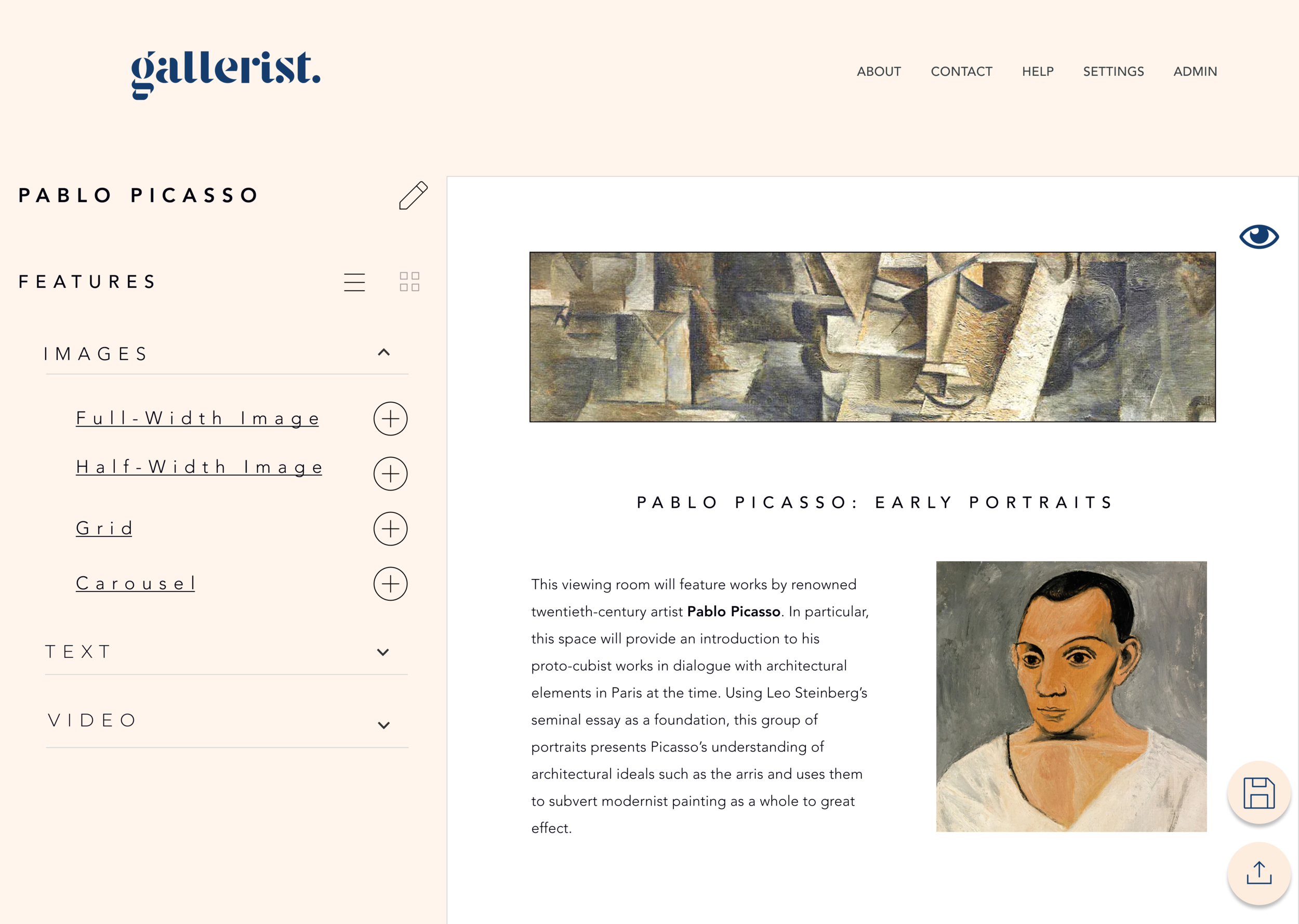
The next wireframes draw out the editing platform. On the left third of the page, I created a panel of the features a user can add to their viewing room. For this initial iteration, I limited these features to three categories: images, text, and video. The user can select from the drop-down menus and add their desired feature to the preview panel in the right two thirds of the frame. My wireframes also show how these features will appear, how to edit and enact upon these features in the editing column, and what would happen if a user clicked on an image for more information.
The user can also preview the live viewing room beyond this editing platform by pressing on the eye at the top right. I ensured that the preview in the editing platform and the live preview maintained the same size ratio of text with the titles and the body text.
Branding
In thinking about Gallerist’s branding, I came up with a few adjectives that served as tenets in my branding philosophy: clean, classic, straightforward, minimal. For me, my goal was to not have the branding detract from the art contained in the user’s viewing rooms. I thought of gallery spaces and museums, and how their use of materials placed priority on the art at hand. Concrete grey floors, subtle wood, white or grey walls— nothing about the architecture overpowered the art contained in these spaces.

I also thought about matted frames that contained works of art. The most popular colors for mats are white, an off-white cream, and a dark blue or navy. These colors influenced the color scheme of Gallerist. I wanted something distinctive and elegant and, again, did not distract from the art. The palette I chose is accessible as well, with a 10.13:1 contrast between the cream and the navy tones and a 20.8:1 contrast between the blue-black and the white.

I found the font Stanley to be the perfect serif to convey these ideals for the Gallerist logo. I also wanted a unique “g” to be an app logo, and Stanley fit the bill.

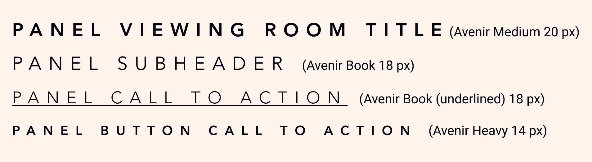

For Gallerist’s overall text, I sought a serif that was not only clean but also legible. My goal was to create an app that could be used by anyone, be it viewing room experts or novices to the platform. To achieve that, accessibility played a large role in my branding. The font I chose was Avenir, and I applied it across the platform in different sizes and weights. The color scheme as well was chosen with accessibility in mind, passing contrast tests with high ratios.

Main Screens

Add a New Viewing Room

Modal Feature

Live Preview

New Design Iteration: Text Editor
Mockups
My mockups were built upon the foundation laid by the wireframes. On the homepage, I elaborated upon the design by introducing a navy blue banner behind the viewing rooms. On the editing platform, I created a distinction between the editing platform— navy and beige— with the blue-black and white viewing room preview.
I also realized how many more actions I had to account for beyond what I had sketched out in my wireframes. For example, how would the modal look for uploading images for a grid or carousel? How about saving the viewing room or a notice ensuring that the user wanted to publish their OVR?
In addition to these features, I wanted to add further customization to the viewing room, such as changing the style of font or the size within a certain range within body texts and headers.
Summary of Usability Tests
I completed four usability tests with a low-fidelity prototype on two groups of users: those who had built viewing rooms in the past and those who did not work in the art world. I tested creation of a viewing room and editing of a viewing room in my prototype. These test subjects fell into the demographic determined through my user research. They were:
Gallery Associate, 30 years old, female
Gallery Director, 28 years old, female
Software Engineer, 40 years old, male
Project Manager, 30 years old, male
Key Findings from Tests
There were positive results with visual design. Users said that it was “clean,” “neat and easy to understand,” and that they “like the color scheme.”
Three out of four users tested used the same word to describe the product: intuitive. No one encountered major difficulties in building viewing room. However, there was some initial confusion with the icons, but as the test continued, the users better understood the affordances.
Some users thought the dotted outline for features boxes, especially text boxes, indicated that the feature could not only be edited but also moved. The Gallery Associate suggested adding that to the homepage when hovering over the viewing rooms
Additional A/B Testing
I also conducted a later A/B test with the same set of users when refining my prototype based on their responses. I tested two different considerations to my design:
Collapsible column of features at left with full-page preview behind
Moving “save” and “publish” buttons out of left column onto the preview screen

The above mockups illustrate the idea of a collapsible features column rather than a fixed one on the editing platform. There was an overall neutral response to this panel— no one had a preference one way or another. However, the Project Manager brought up a great point, saying “I think that this aspect would be good for smaller computers so that the space is better optimized.”

I also had the idea of moving the “Publish” and “Save” buttons from the left to the right in line with the Preview eyeball button. These calls to action would be illustrated with an associated icon. Again, there were varied responses that were not quite negative. but not much in favor either.
“Button change would be a minimal intervention, and I’m not sure if one is better than the other,” said the Gallery Associate. “Since I’m not interacting with it that often, it would not make a huge difference.” On the other hand, the Software Engineer appreciated how the shift cleaned up the design: “I like the button on the right side since it makes the left column less cluttered.”
Ultimately, given the variation of responses, I decided not to move forward with either design in this iteration. Instead, once the MVP is deployed, I want to see how users interact with Gallerist and understand if these interventions would be helpful with frequent use.

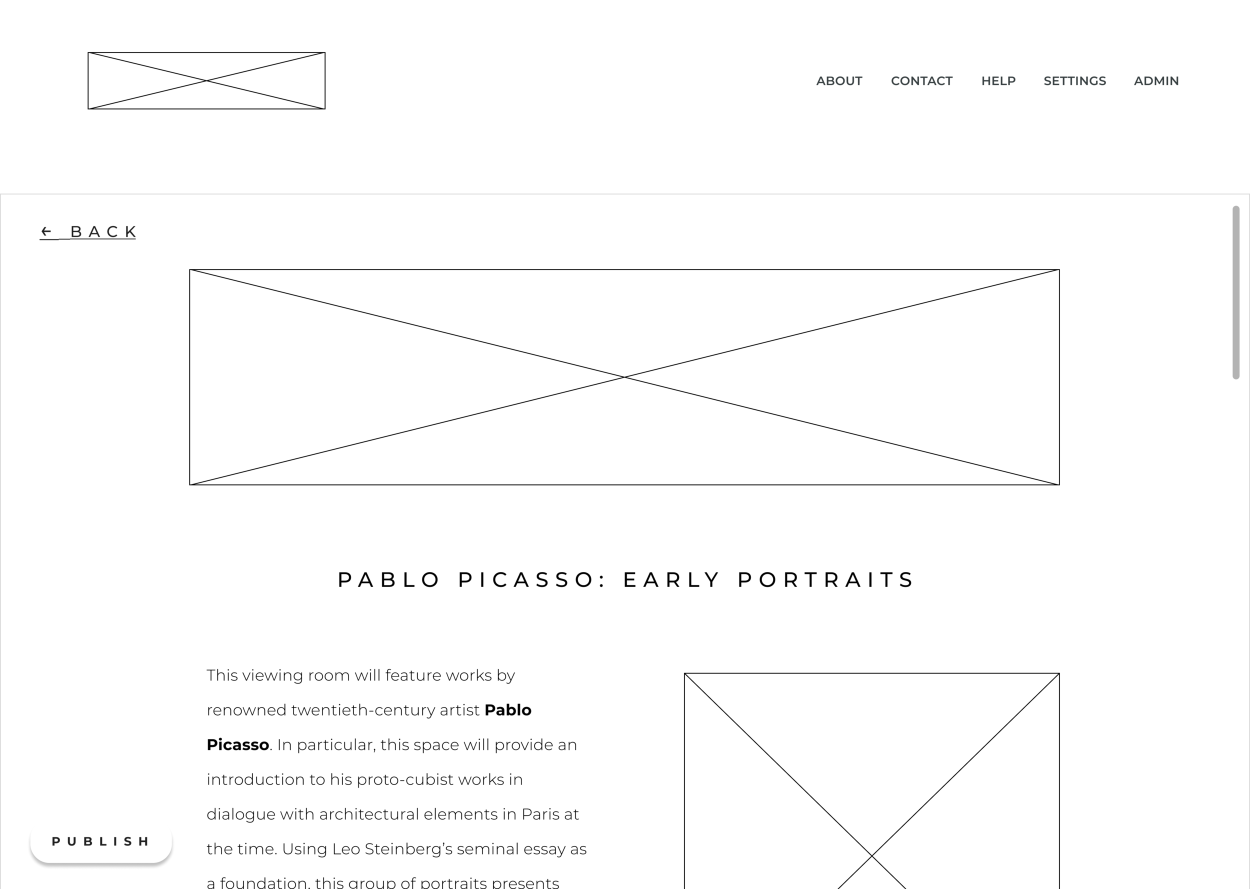
Clickable High-Fidelity
Prototype
For my final prototype, I wanted to focus on the specific user flow of the administrative user. So, I followed linear steps of creating a small-scale viewing room, using the work of abstract artist Hilma af Klint. The user will create a new viewing room, build it out using specific features, preview the viewing room, and publish it. For my prototype, I kept the left column of the editing platform fixed and the preview scrollable as it would be when it is a live page. In addition, I added the hovering dotted outline feature as suggested by users in testing.
Features Backlog
Given the scale of the project, there were many features that I could not include in the initial iteration of Gallerist. They include the following:
Generating a sales pipeline through inquiries on viewing rooms
Augmented reality features that allow clients to view art on walls, perhaps through a camera in their own home
Versioning, allowing the user revisiting older saved edits to a viewing room
Transform Gallerist into a responsive web app and give users the ability to edit mobile view of viewing room (similar to Webflow)
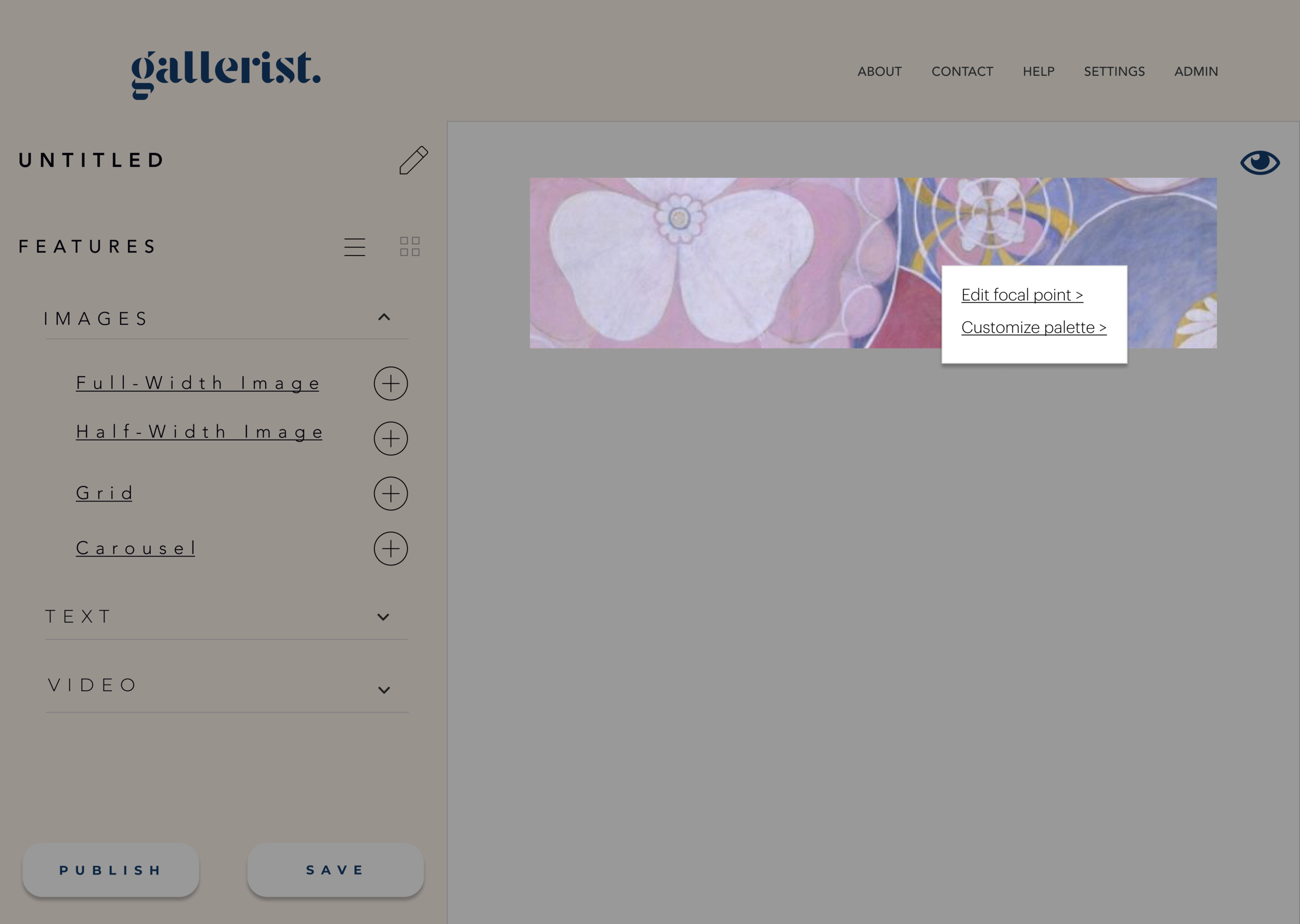


I also had ideas for further customization of Gallerist viewing rooms, as it was important to survey respondents (i.e. current users of viewing rooms). One such idea was to coordinate the color palette to the art in the viewing room, perhaps by right clicking each image to select a default set of colors with a coordinating accessible font color.
What I Learned
Specificities of target market
When I tested the product on gallery workers, they presumed a lot of grid image indicators signified image features. This was not the case with those tested outside the art world. Although the latter group understood image features as I expected, that wasn’t the case with my target market. Therefore, I revised my design to be more accessible to this demographic.
Web app accommodations
Using default desktop dimensions suggested by Figma is not necessarily “default!” After I built my prototype using Figma’s default dimensions, I discovered that it did not suit the screens of many users tested. I then remade my prototype with more appropriate dimensions for a more successful MVP. I achieved this end product though additional research and education, and I am proud to say I am well-versed in building a web app on Figma.